
Orlando, FL – With the NBA offseason quickly approaching, teams across the league have slowly begun to unveil their new uniforms. It’s really exciting because we’re getting closer to the season starting again, but there is something to be said about the NBA City Edition uniforms this year.
So we’re going to look at the good, the bad, and the trash of the league uniforms.
ORLANDO MAGIC
Let’s start with the one I was most disappointed about, the Orlando Magic “City Edition” Jersey. These uniforms are all white with orange pinstripes and are meant to represent “Orange County”. Also, they incorporate the abbreviation “ORL” which if you didn’t know, stands for Orlando.
While It’s different, and I understand what they were trying to achieve, there’s nothing like the Orlando blue. Moreover, the orange is kind of tacky and I would’ve preferred the original “MAGIC” with the signature star instead of “ORL”.
The moment you've been waiting for… #cityedition 🍊 pic.twitter.com/AO7FCNFVfk
— Orlando Magic (@OrlandoMagic) November 10, 2020
OKLAHOMA CITY THUNDER
Next up we have OKC Thunder and their new “City Edition” jersey. I gotta say this was one of my favorites so far. The new uniform is mainly black instead of just orange and baby blue with pinstripes on the baby blue stripe. Also, the full “OKLAHOMA” detail is small but ties the uniform together. It’s a sleek and simple uniform and doesn’t completely change the team’s traditional colors.
https://twitter.com/okcthunder/status/1328356623572742146
SAN ANTONIO SPURS
Another flop in my opinion, next up we have the San Antonio Spurs “City Edition” uniforms. These uniforms are very different from the usual grey, black, and white combo but not in a good way. The “fiesta” colors are inspired by their warm-up gear in the 1990s, which fits into what most teams are doing in bringing back old 90’s aesthetics.
While this uniform is one of the most anticipated uniforms, it’s at the top of my list for most disappointing. I think it’s too different from their usual color palette and I’m personally just not a fan of the highlighter colors.
Old School. New Style. Authentic Heritage.
Introducing #SpursFiesta—our 𝟐𝟎𝟐𝟎-𝟐𝟏 𝐂𝐢𝐭𝐲 𝐄𝐝𝐢𝐭𝐢𝐨𝐧 𝐔𝐧𝐢𝐟𝐨𝐫𝐦. @HEB | #GoSpursGo pic.twitter.com/1rHVaL2jgi
— San Antonio Spurs (@spurs) November 13, 2020
PORTLAND TRAILBLAZERS
Next in line, we have the Portland Trail Blazers and their Nike City Edition jersey that pays homage to the state of Oregon. Truly one of the few favorites of the bunch, because these uniforms also pay tribute to the tribal nations throughout Oregon.
I am a big fan of the tribal colors and how well it goes with the brown of the uniform. It serves a strong message while also being stylish.
Our 2020-21 uniform celebrates the unique beauty of Oregon’s landscape as well as acknowledging & honoring the tribal nations throughout what is now considered Oregon who have called this land their home from the beginning.
Take a closer look: https://t.co/rDbfOWf2In pic.twitter.com/j7fKjOGA3w
— Portland Trail Blazers (@trailblazers) October 29, 2020
BOSTON CELTICS
Here we have the Boston Celtics with their new City Edition jerseys. They’re bringing back the classic green and white that they’re known for. Also, the uniforms resemble the banners up at TD Garden. I have nothing more to say about these uniforms, there’s nothing drastically different about them.
From the rafters to the parquet, it’s all about #TheBanner. pic.twitter.com/YVwvba5U1j
— Boston Celtics (@celtics) November 20, 2020
ATLANTA HAWKS
Another one of my favorites for this season is the Atlanta Hawks‘ new city edition jerseys. I like their use of the signature colors while promoting another strong message. This year the team has announced their partnership with the estate of civil rights icon DR. Martin Luther King Jr, the NBA, the National Basketball Players Association (NBPA), and Nike. It’s cool because it continues the theme of “racial equality” that we saw throughout the NBA restart.
No question which one is our favorite 👀#EarnTheseLetters | #TrueToAtlanta https://t.co/CCOXHuu6aO pic.twitter.com/ZyxR31VuJg
— Atlanta Hawks (@ATLHawks) November 13, 2020
BROOKLYN NETS
Up next we have the Brooklyn Nets and their NBA city edition uniforms that pay homage to their “tie-dye” jerseys that were worn during the 1990-91 season. Okay, so I don’t absolutely hate these jerseys. It’s different from their normal black and white colors, but not in a bad way. It’s a uniform that’ll take getting used to, especially with the tie-dye detail.
The Nets unveiled their new City Edition uniforms, citing inspiration from revolutionary artist and painter, Jean-Michael Basquiat.
(via @BrooklynNets) pic.twitter.com/xfDTbAqNlQ
— NBA on ESPN (@ESPNNBA) December 3, 2020
From Jersey to Brooklyn and back again.@KyrieIrving | https://t.co/LfHszf2qmA pic.twitter.com/TJKLwqUmPg
— Brooklyn Nets (@BrooklynNets) October 14, 2020
CHARLOTTE HORNETS
Next, we have the Charlotte Hornets with their NBA city edition jersey and their Official jersey patch partner uniforms, which are my personal favorite. The city edition jersey features double pinstripes along with the original mint and white colors.
The patch partner uniforms celebrate Charlotte’s history as the home of the first Branch Mint and the Carolina Gold Rush of the early 1800s. The gold and granite accents represent the state rock of North Carolina.
The time is now to be Buzz City Minted. 🐝
The journey to greatness continues. Who else is ready for this season to begin?! 🙌 pic.twitter.com/XIz81yEpRG
— Charlotte Hornets (@hornets) November 14, 2020
CHICAGO BULLS
Next, we have the Chicago Bulls. Their city edition jerseys were designed to honor Chicago. They pay homage to Daniel Burnham, a city planner who designed the city after the great Chicago fire. These uniforms are one of the better ones, simple, but as they said, “it’s all in the details”.
It’s all in the details 🔥 pic.twitter.com/nULf1sEDEe
— Chicago Bulls (@chicagobulls) November 13, 2020
DENVER NUGGETS
The Denver Nuggets unveiled their new uniforms. They claim that these uniforms are bringing a different “flavor”, as opposed to their black jerseys from last year. I don’t hate it, but I don’t love it either. Quite frankly, I enjoyed last season’s jerseys a lot more, but perhaps it’ll just take some getting used to.
https://twitter.com/nuggets/status/1329516042205454336
DETROIT PISTONS
Here we have the Detroit Pistons and their new City Edition jerseys. The Pistons want their uniforms to pay homage to Detroit’s long history in the automotive industry. Across the chest, they will have “Motor city Detroit Michigan” to resemble the vintage auto emblems. Another simple city jersey, but it’s not awful. Also, I think the font is outdated and feel like more could’ve been done with this to take it from being good to being great.
Our city. Motor City. pic.twitter.com/pSkKQQ26KB
— Detroit Pistons (@DetroitPistons) November 20, 2020
GOLDEN STATE WARRIORS
Next up, we have the Golden State Warriors and their Nike City Edition design. It is supposed to honor the city of Oakland, where the Warriors played for 47 seasons. Quite possibly one of the cleanest unveilings of this season. I love the colors, the font used, and the location of the stripes. It’s classic and retro without the need for bright obnoxious colors. I can’t wait to see these on the court in December.
Oakland is and will always be a part of our team’s identity.
“Oakland Forever," presented by @Rakuten, is a nod to the We Believe era and its turning point in Oakland’s basketball history.
To honor the Town, we partnered with Nike to put a spin on these classic uniforms. pic.twitter.com/d7nUAJLbzM
— Golden State Warriors (@warriors) November 2, 2020
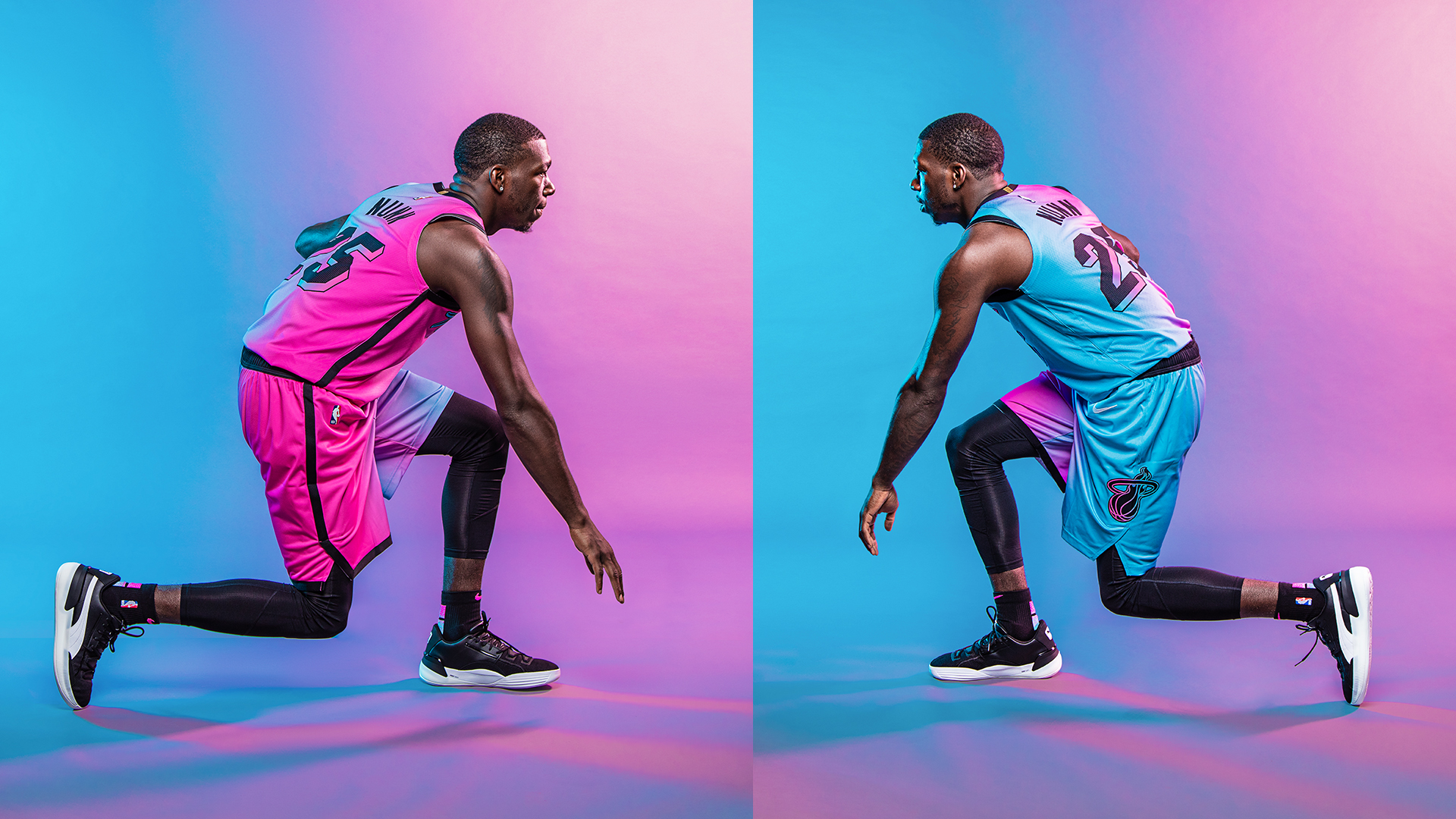
MIAMI HEAT
Unfortunately, up next we have the Miami Heat and their NBA City Edition “Vice-Versa” uniforms. I really had high expectations considering how cool the vice uniforms were. However, sadly, all these uniforms did was remind me how much I miss Trix yogurt and my childhood.
Fit for the future.
Preorder your #ViceVersa jersey Wednesday night at Midnight.
@MiamiHEAT // @AmericanAir pic.twitter.com/WnWETPe7qH— Miami HEAT (@MiamiHEAT) December 1, 2020
MEMPHIS GRIZZLIES
Here we have the Memphis Grizzlies and their City Edition jerseys that capture the rich history of soul and music. The jerseys are intended to be a tribute to both Stax Records and singer/songwriter Issac Hayes. Another one of my favorites this season, the details on the sides of the jerseys and along the bottom and side of the shorts make these unique from the rest. Also, the colors don’t stray too far from the original color scheme which is also a plus.
The @memgrizz are celebrating the legacy of Stax Records and the life of singer/songwriter Isaac Hayes during the 2020-21 season with new Memphis Soul City Edition @Nike uniforms.
Press release below. For more information: https://t.co/W22N1P6u2t pic.twitter.com/MF3DJ5ULo2
— Grizzlies PR (@GrizzliesPR) November 24, 2020
NEW ORLEANS PELICANS
Next, we have the New Orleans Pelicans and their new City Edition Jerseys that were inspired by the city municipal flag. For me, this design looks cheap and outdated, especially standing next to some of the vibrant jerseys from this season. While it pays homage to their city, I definitely think they could’ve taken a different approach because this design just looks lazy.
Passionate. Resilient. Unparalleled.
There's only one New Orleans. ⚜#WontBowDown pic.twitter.com/WzigGHRVvd
— New Orleans Pelicans (@PelicansNBA) November 13, 2020
PHOENIX SUNS
The Phoenix Suns and their City Edition jerseys celebrate the Arizona region by having “The Valley” written across the chest of the jersey. Another disappointing one for me, I’m personally not a fan of the pixelated colors and the font. There’s not much to it besides that.
We support The Valley.
We play for The Valley.
Now, we are reppin’ 𝗧𝗵𝗲 𝗩𝗮𝗹𝗹𝗲𝘆.
City Edition 2020-21: https://t.co/t1l2nEvmiF#WeAreTheValley pic.twitter.com/2BeZ720Dag
— Phoenix Suns (@Suns) November 12, 2020
SACRAMENTO KINGS
The Sacramento Kings‘ new uniforms take elements from four past kings uniforms – The 1985 Baby Blue Road Uniform, 1994 Checker Alternate Uniform, 2000 Black Road Uniform, and the recent 2019 Red Sactown City Edition Uniform.
https://twitter.com/SacramentoKings/status/1325862116553789440
TORONTO RAPTORS
The Toronto Raptors have decided to unveil three of the five uniforms that they will be using this season. Their uniforms will take elements from the history of the franchise.
Which North are you? #WeTheNorth pic.twitter.com/xmATeh0AaD
— Toronto Raptors (@Raptors) October 15, 2020
DALLAS MAVERICKS
The Dallas Mavericks unveiled their City Edition to honor Dallas’s most iconic and powerful symbols of the City of Dallas, the legend of the Pegasus. The new City Edition uniforms boast a white base with dark characters and gold trim around it. I love everything about these uniforms. While it doesn’t stick to the original color scheme, they’re just too clean not to love.
A departure from our traditional blue and a signal that a bright future is on the horizon ✨ @chime | #MFFL pic.twitter.com/Y3dfRK8Vvw
— Dallas Mavericks (@dallasmavs) November 24, 2020
LA CLIPPERS
The LA Clippers will have a City Edition uniform that looks a lot like the versions from the 2019-20 season, with some subtle changes. They have once again partnered with globally renowned artist, Mister Cartoon. There isn’t anything special about his uniform, it’s simple and to the point, and maybe that’s okay.
Running it back in black. pic.twitter.com/tFDhLH82i1
— LA Clippers (@LAClippers) December 1, 2020
MILWAUKEE BUCKS
The Milwaukee Bucks have decided to stray away from their original colors and dedicated their uniforms to the roots of the city. The Team unveiled the all-blue uniforms, to pay homage to the meaning of Milwaukee: the gathering place by the water.
Blue(s).
Inspired by Milwaukee’s meaning as “the gathering place by the water,” introducing the 2020-21 City Edition uniform.https://t.co/j5BaEDFYp0 pic.twitter.com/lJ27gYuYQI
— Milwaukee Bucks (@Bucks) December 1, 2020
INDIANA PACERS
The Indiana Pacers have refreshed their City Edition uniform to pay homage to a significant part of the team’s history. The Nike VaporKit uniform features pinstripes for the first time since 2013. Sticking to the theme of bringing back classics, I am a huge fan of the pinstripes with the team’s colors. It’s a pretty simple thing to bring back, but I don’t hate it.
These are more than pinstripes. They are a symbol of who we are and what we represent.
There is #PowerINPinstripes.https://t.co/c1uqbVoVd9 pic.twitter.com/eGMLEPXjTd
— Indiana Pacers (@Pacers) December 1, 2020
LOS ANGELES LAKERS
Lastly, we have the Los Angeles Lakers and their new NBA City Edition jersey entitled “Legacy of Laker Lore”. It strays away from the famous purple and gold combo making it the only Lakers jersey I would contemplate dropping money on. This jersey has dropped on the NBA website, but we’re still waiting for an unveiling from the team themselves.
OFFICIAL: Los Angeles Lakers City Edition Jersey
‘Legacy of Laker Lore’
Shop now @ https://t.co/oK4ilLPdxa pic.twitter.com/eQvlprLMAY
— LakeshowWRLD (@LakeshowWRLD) December 3, 2020
The NBA preseason starts next Friday. I can’t wait to see these in action!
📸 Credit: David Alvarez // Miami HEAT

More Stories
FIU Men’s Basketball Transfer Portal Tracker
FIU and UM Players to Participate in Portsmouth Invitational
Heat Waive Terry Rozier III and Sign Jahmir Young